 Creating overall maps provides a top-level view of what your sources report about the system.
This can for example help in understanding the mental models of your stakeholders, which may differ from your own or your project's theory of change. This allows you to identify what your stakeholders collectively believe are the project's most important mechanisms and outcomes.
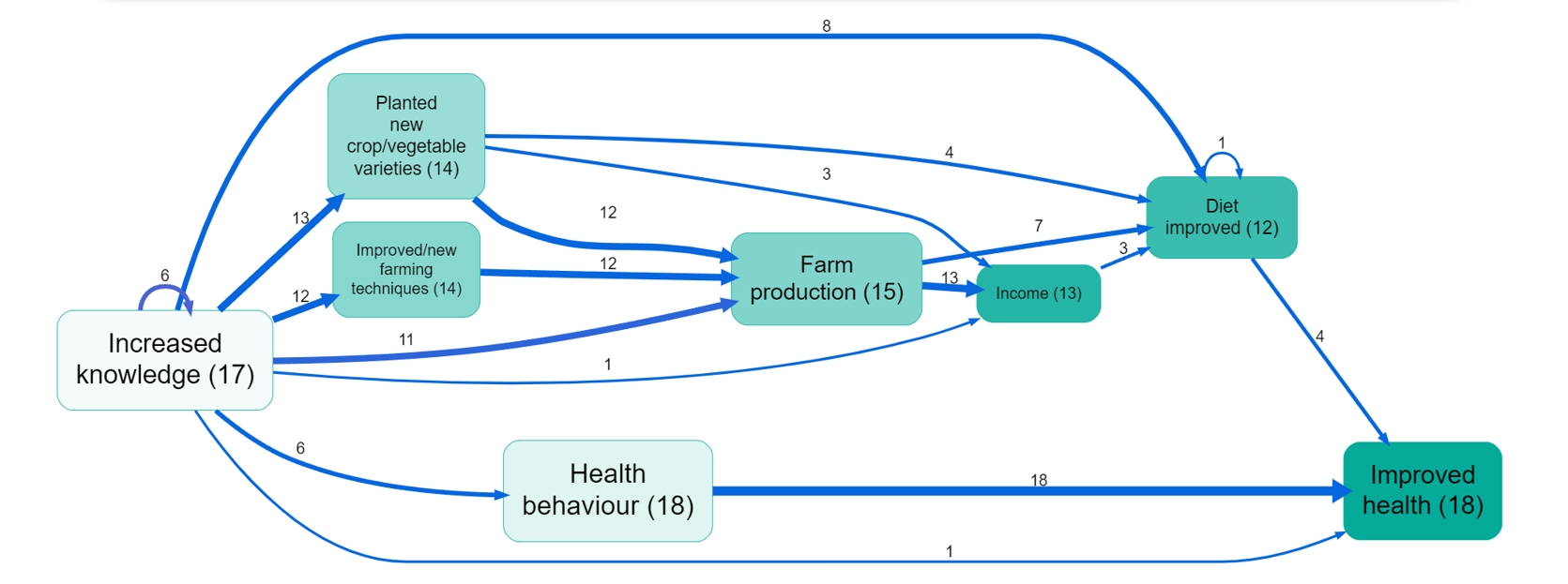
While simply listing the main factors and links is interesting, it can be much more informative to view the map which remains when we filter the links table to retain only the most important rows. There are eight ways to do this, resulting as a combination of these three choices:
- Filter factors versus links
- Filter with respect to sources versus citations
- Filter by retaining only the top n items versus retaining only the items with a count of at least n
- So for example we might filter to retain only the top 10 factors by citation count. Often we find it useful to use two frequency filters: an initial filter for only say the top 10 factors may still result in so many links between these factors that the map is still hard to understand, so we add another filter, this time filtering on links frequency.
Viewing your map like this helps you identify common themes, key pathways, and shared assumptions about a project or system. You can use these insights e.g. for aligning stakeholder expectations and project goals.
Filtering for the top factors and/or links#
Filtering for the top, say, 5 or 10 or 15 links is a good way to produce relatively consistent maps and tables.
You can also format the links and factors in your map to reflect the data, e.g. you can make factors bigger if they were mentioned more often.
Note that if you select the top 10 links or factors, you may not get exactly 10 due to ties.
Zooming out#
Using Hierarchical coding is a great way to bring structure into a complicated list of factors. If you have done that, you can use to simplify your map.